Almost a month ago I heard about a new feed for the Flickr homepage which was slowly rolling out to users. Since then I have eagerly been waiting for the feed to be rolled out to my account. This past weekend it finally arrived and today I had a chance to play around with it. So here are my two cents on the changes. The new feed design seems to try and address two primary things:
- Show the user more images they might be interested in.
- Allow for all of the most common interactions without leaving the feed.
Showing images that a user might be interested in directly on the main feed is something Flickr is way behind on. Competing services do a great job of showing you not only new pictures from your contacts but also just great photography that you should find appealing. If you look at it from a very simple view you could say that is the model for all modern social networks. You learn about your users and then feed them what they like. So the line of thought behind the new feed feels a bit like an awakening, that Flickr is finally finding it’s place in the landscape of modern social networks.
Feed Tabs
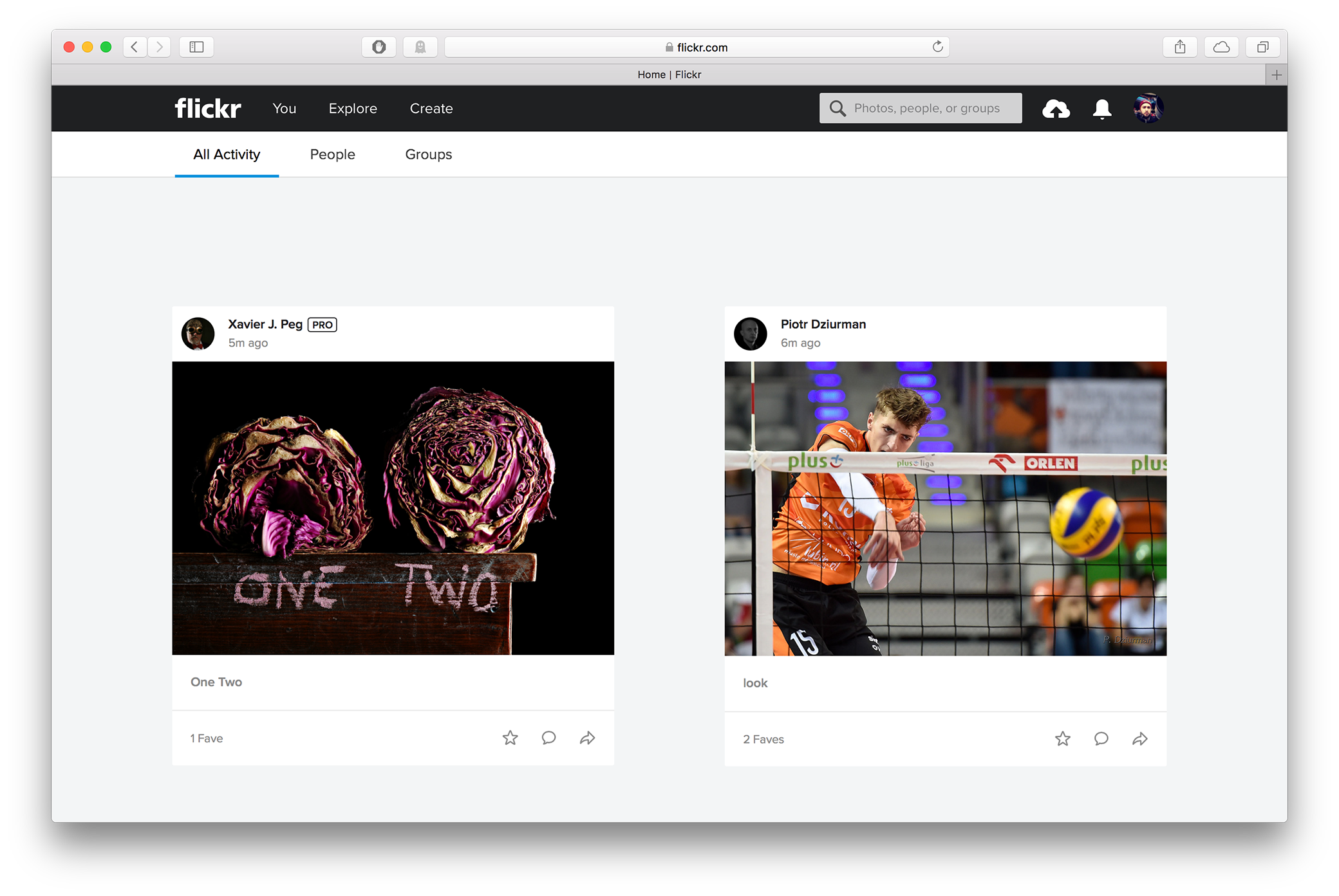
The new Flickr feed pulls in new photos from your contacts and from groups. It also adds random recommendations that their algorithm believes are of interest to you. The feed can be toggled directly from the menu, so it is very easy to switch to a view of just photos from your contacts or a view of photos from just your groups. The one big downside is that new feed feels like it is clearly still being developed. There are bugs both in the appearance of elements and in the content being displayed. Visually, the biggest problems is in the balance between pictures and white space. I feel like it is not at all balanced. Just look at the screenshot below to see what I am taking about.

The white space is massive. There is so much white space that you do not even seen past the first two images. In my opinion both the white space between the sub menu and the first row and the white space between images should be greatly reduced. I believe that by reducing the white space there is a more harmonious layout that has larger images and fits more images on screen.
But these visual problems are likely minor and hopefully refined upon and improved. If we Look past them focus on the content that is shown then we find that there are some impressive changes. I was especially impressed with a photo that was recommended to me. I was scrolling through the feed and a photo from a photographer who shots professional football in England pops up. It was marked as “recommended” and when I went to his profile I saw that I was not following him. I was pleasantly surprised by this recommendation because of how well it fits me. It’s the kind of user I normally follow and also the type of photo I tend to invite into the Flickr group that I manage. So in other words the recommendation was spot on. It definitely made a good first impression for the new feed and has me looking forward to seeing how well Flickr’s algorithm has me pegged.
Inline interaction
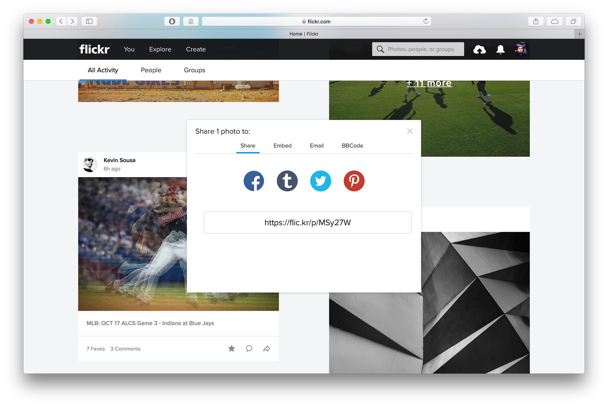
The interaction model on the new Flickr feed is also pretty good. It has been designed so most things can be done directly in the new feed. You can comment on a photo and you can mark a photo as a favorite all without leaving the feed. You can also share a photo on a number of external services like Facebook and Twitter. There is one glaring omission though you can not do invite a photo into a group on Flickr from the main feed. In my opinion this is a huge mistake and I hope they address immediately during this limited roll out.
User engagement needs to be top priority and groups are a part of Flickr just the same as comments and favoriting a photo. It is all internal engagement which keeps people on the site. The screenshot bellow shows the share button pop-up modal and as you can see there is plenty of room it add a tab to send images to groups. Honestly it should be prioritized over external sharing to Facebook, Twitter, and other services.

Pop-up Photos
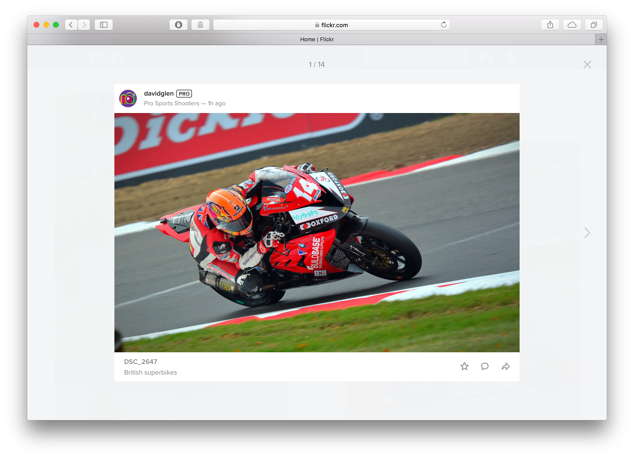
While surfing the new feed you can click on the photos and bring up a larger pop-up modal view. This is a welcome addition as it is nice to get a large view without having to go to the actual photo page. However this is something that needs a lot of work. It’s a really good idea but the current iteration is just sloppily executed. The pictures that pop-up are not much bigger than the ones in the feed. As a matter of fact, in most cases vertical (portrait orientated) images are actually larger in the feed than the pop-up version.

Look at the above example which is a picture in horizontal orientation. It is larger than the image shown in the feed, but not by much and look at the amount of white space that is around the image. If you are going to do a pop-up view with larger images then go all in and fill the screen. You could easily increase the image size eliminating most of that white space and still maintain all the extra elements. Go big or go home.
Notifications
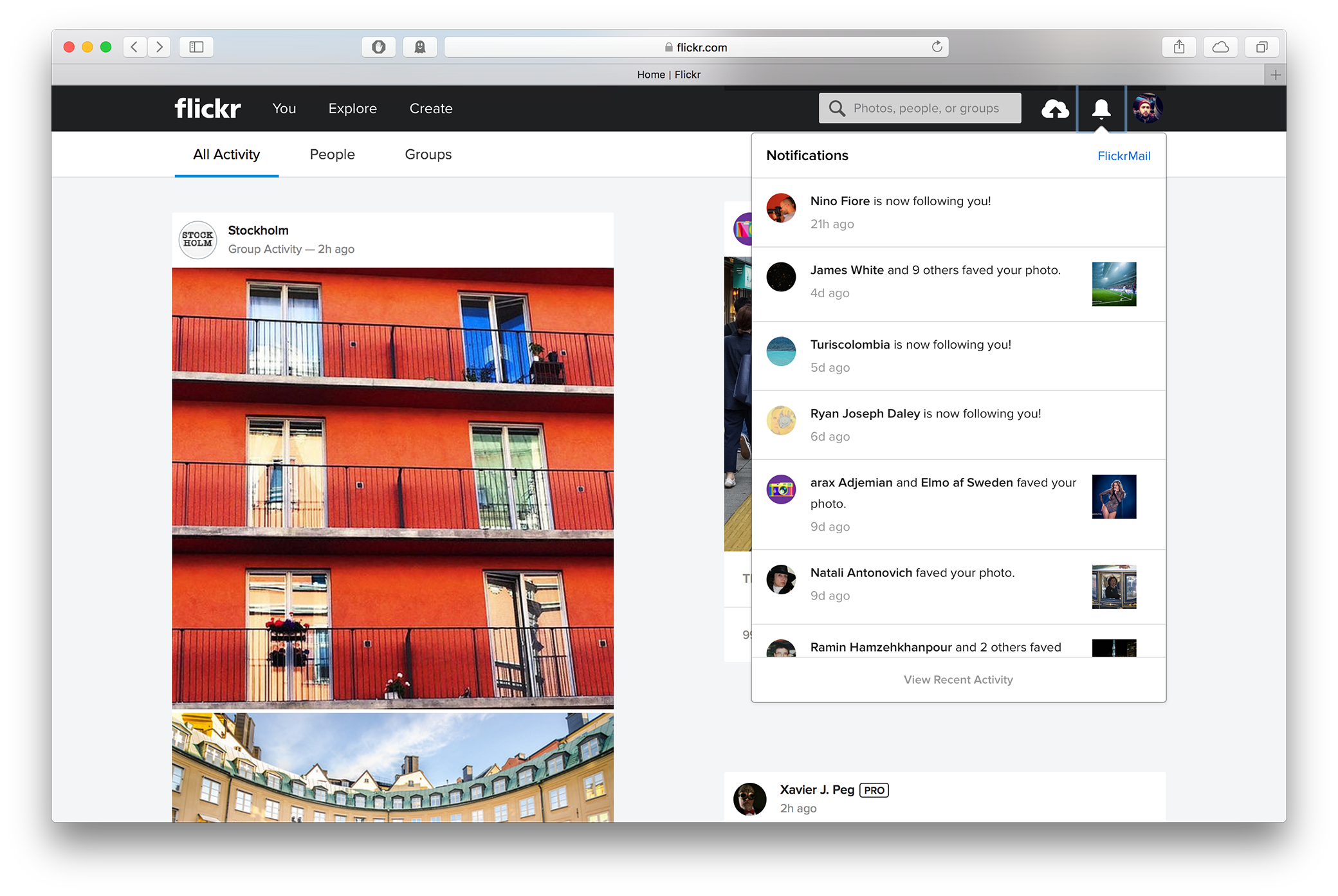
Finally they added a new view for your notifications. Previously notifications would be scattered within your feed. Now they are accessible from the bell icon in the top menu. Moving them into this one location makes a lot of sense. It has become the standard social network practice for showing notifications and that kind of familiarity is good for new users. It’s a minor change but it’s a change that goes a long way.

Overall I am pretty impressed with these changes and looking forward to using the new Flickr feed. I think it still needs some refinement, especially in the balance of the layout, but it is a great step forward. I’m really looking forward to getting more recommended content and discovering new photographers who I will want to follow. If you are interested you can find me on Flickr at my usual handle: CampanellaFoto. There is also a thread about the new Flickr feed on the Flickr Help forums.