The other day I posted about the awesome new search on Flickr. Now the rest of the new design has gone live for me. After spending some time checking it out, I have formulated some thoughts on it.
Design

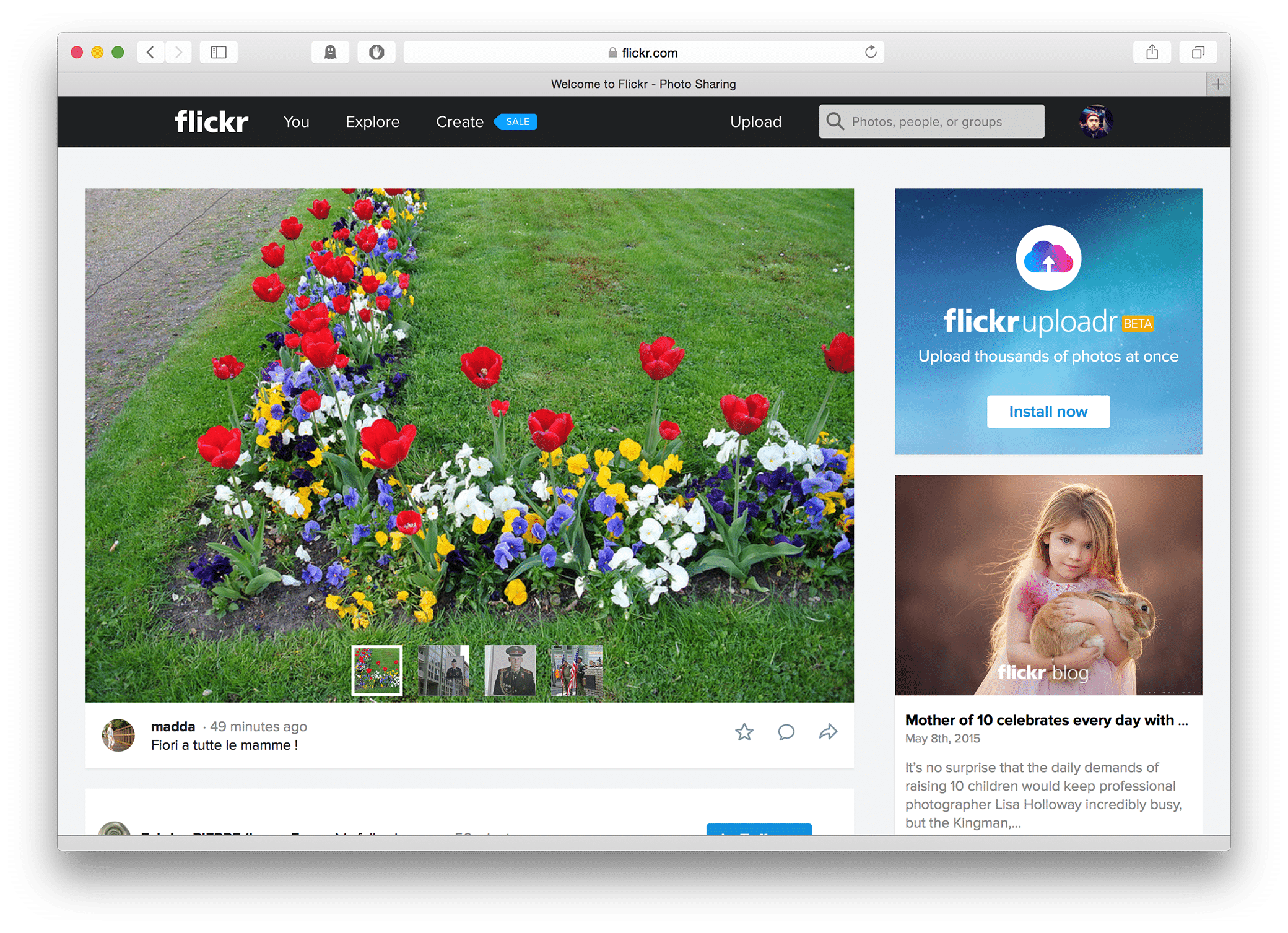
Overall the look and feel of the new Flickr website is very nice and feels like an improvement over the previous version. It is similar to the previous site, and feels like its been touched up just a little. The fonts and icons are all very nice. The website and the apps are now sporting a matching appearance, though I would say out of them the website is the best looking one.
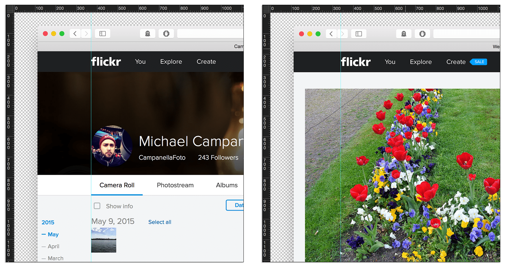
I do feel like there are some questionable decisions in parts of the design. The logo and placement of the navigation menu in the top bar caters heavily to to the layout on the new Camera Roll page. It however does not lineup with any the rest of the pages, which happens to be the majority of the website.

This in itself is not a big deal. With design you have to make choices, but I do feel like the main menu is missing certain important items. Like Groups, which is now buried inside the You menu item. Considering that I think perhaps aligning the menu to match the majority of the site would have been a better choice.
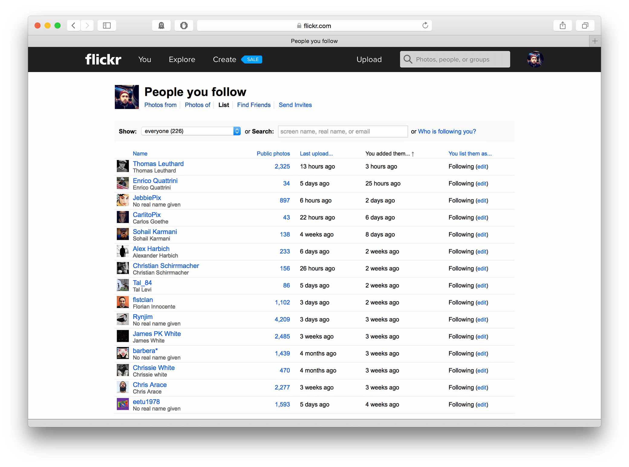
Another irritation with the design is that it is still to easy to find your way back to pages whose appearance have not been updated. With just once click in the menu you can find yourself looking at the original Flickr. This was the case with the previous redesign and it is disappointing that after another redesign it still remains neglected. Throw a new coat of paint on those pages already.

Usability
Using the site remains largely the same, and this is both a positive and a negative. Areas of Flickr that were weak points reamins so even after this update. One such area for me is the front page. I’ve always felt that Flickr should improve the front page so that the user is always being shown amazing new photography.
Something similar to how 500px has their front page. Make it include material from a users contacts, from Explore, and then use an algorithm to pull up the best images I am most likely to be interested in. Which should not be impossible if they look at what groups a user is active in and what photos he has commented on or favored. Then add some filters to easily toggle items on and off.
For me that would make the homepage perfect. Right now it is too dull, especially if you have too little contacts or are following people who’s photos might not be too interesting. This is something than can definitely help retain new users.

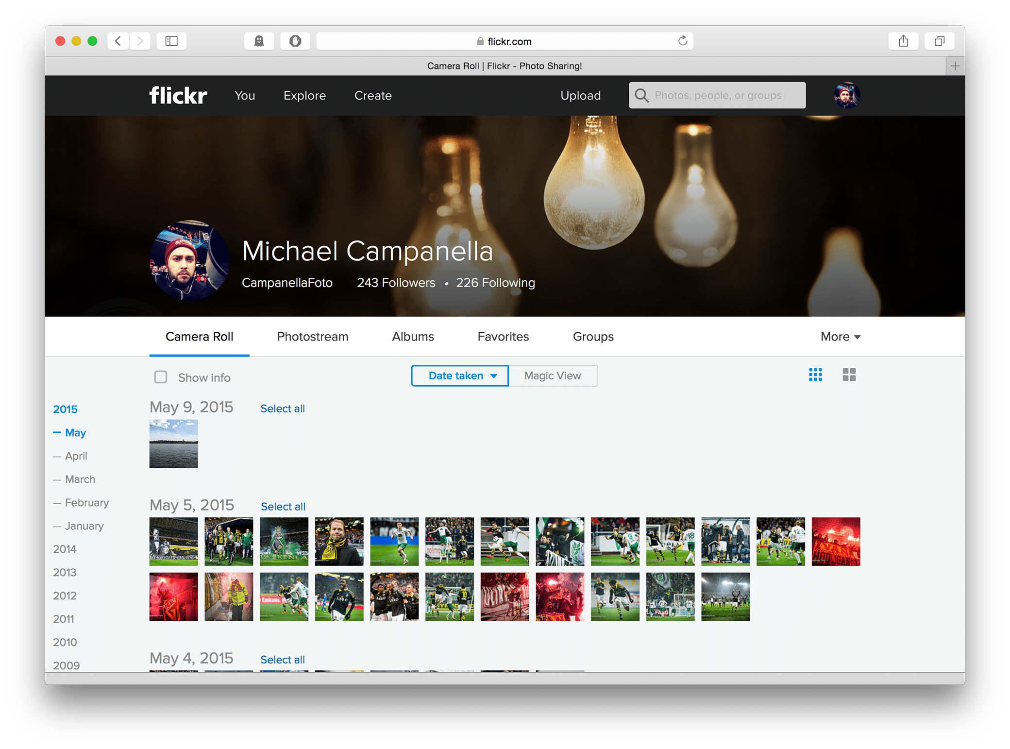
Now that we talked about the negative let’s look at the positive. The new camera roll feature is pretty cool. It uses a familiar timeline layout to show all your pictures chronologically and allow for easy management. From the camera roll it is very simple for you to edit, share, add to an album, download, or even delete your images.
The most impressive feature of the camera roll is what Flickr has dubbed Magic View. When you activate Magic View Flickr will sort all your photos using computer generated tags that match what they perceive the image to contain. Pictures of cats will be automatically tagged cat and sorted under animal:cat, while pictures of kids will appear sorted people:kid.
It is not perfect, sometimes you will catch some incorrectly tagged items. I saw a few hockey players appear under vehicle:bike or a Tokyo fishermen that found his way into people:kid but even with the occasional misfire it really impressive watching it instantly sort your pictures. A blend of analytical information technology and photography. The sort of feature that reminds me of why I feel in love with Flickr many years ago and gets me excited about what could be coming in the future.
Other
I’ve gone on about the new features so much that it would be wrong of me to not mention a major feature which I am not using. I am not using the new Flickr Uploadr. I have not installed it, nor do I plan on installing it. The Flickr Uploadr, which can be installed on either Mac or PC, will scan your computer for images and upload automatically into your Flickr account.
As a working photographer I have to many images on my computer and attached external hard drives. I would run through that free terabyte fairly quickly. Plus I have images I prefer not to upload, even if they are marked private by default.
While I am not using Flickr Uploadr, it is interesting to see where all of this is going. Flickr, much like Apple’s new iCloud Photo library, wants to position itself as the central storage for all of your photography. They have done a good job positioning themselves but will they be able to compete with the likes of Apple, and Google who control so much of the hardware?