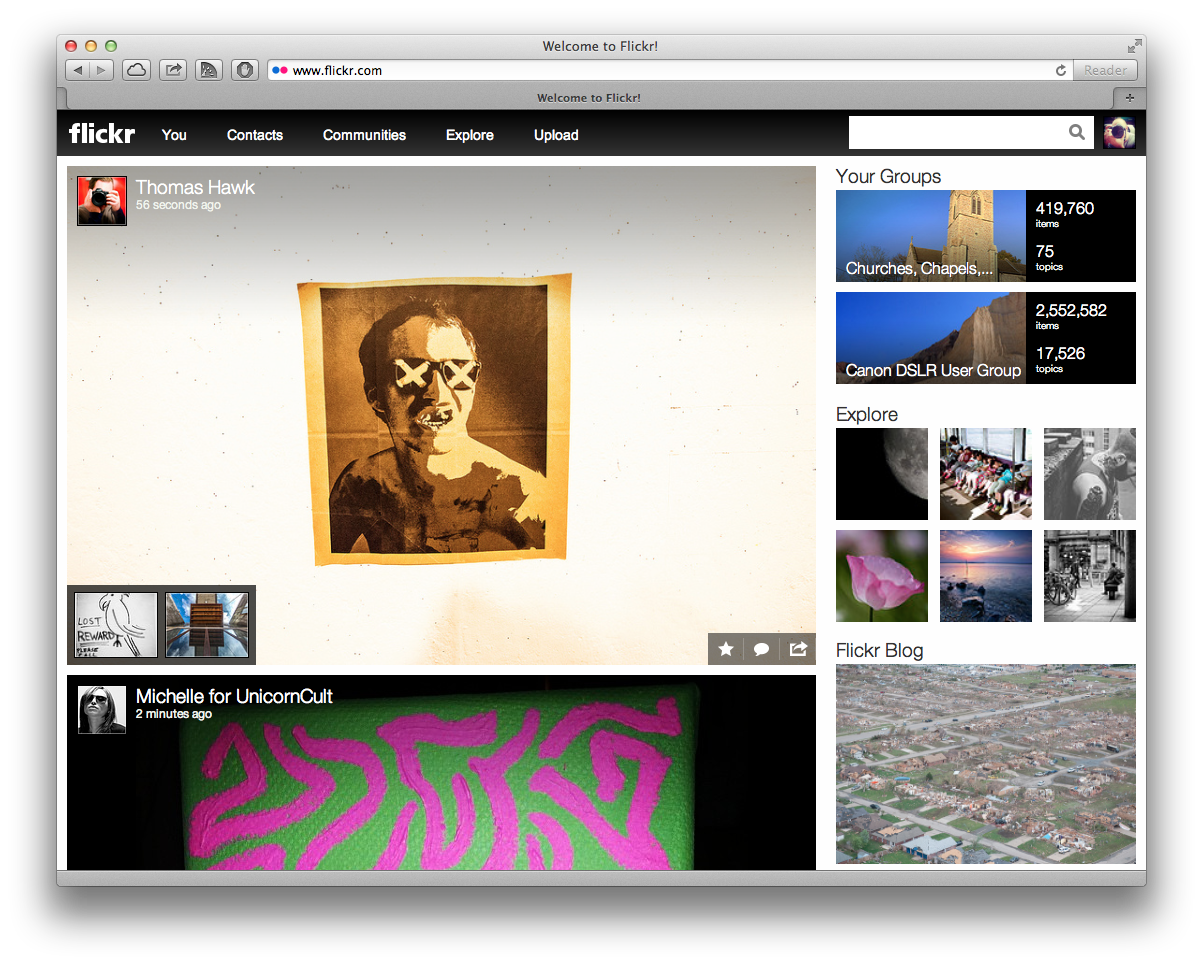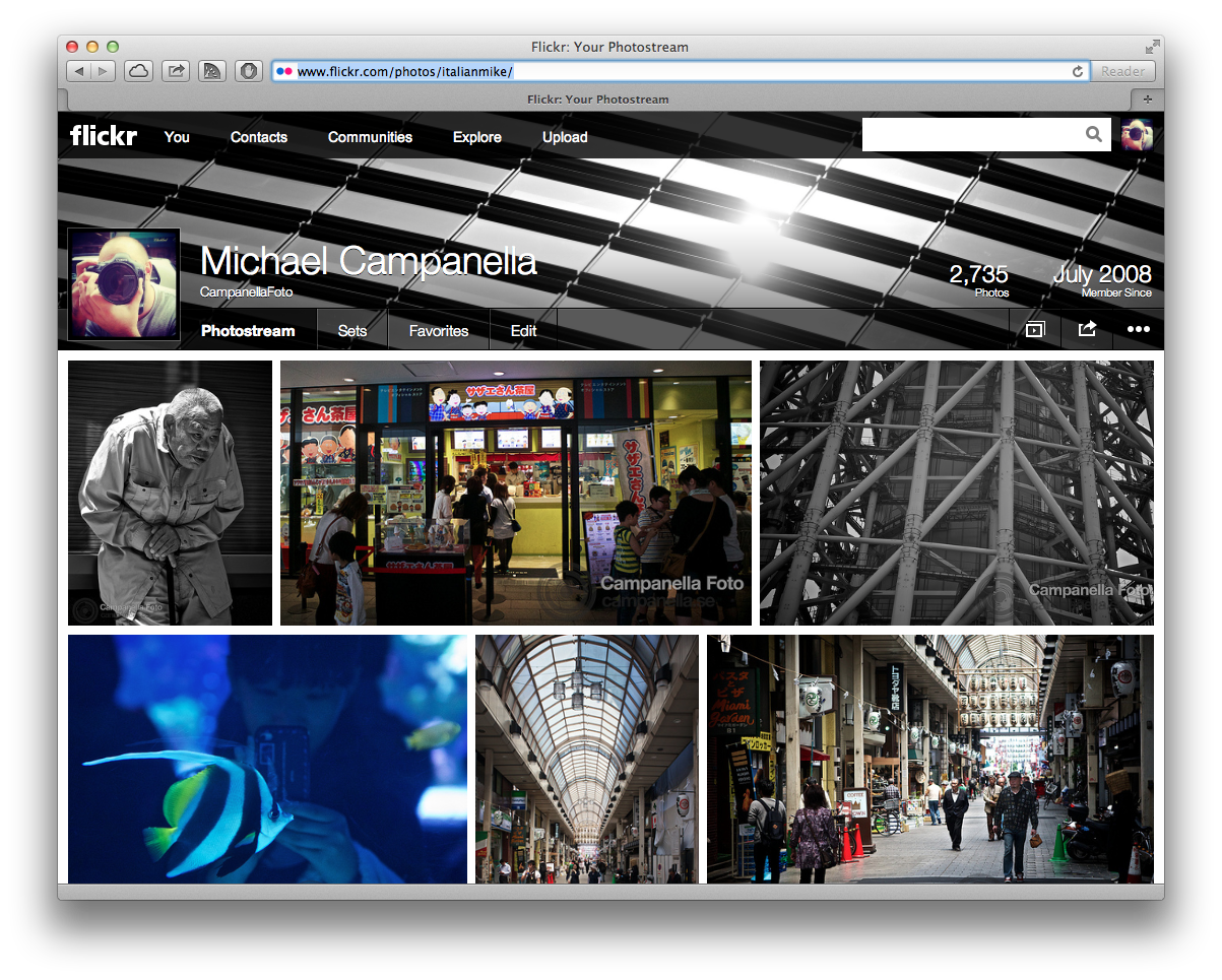
The Flickr website finally received a much needed touch up on Monday as Yahoo unveiled a new version of their photo sharing service. I had a feeling that the Flickr website was finally going to be updated because I had actually gotten to see a sneak preview of the new design back on the 9th of May when a similar version went live on my iPad.
I personally feel that an update to Flickr has been long overdue. I’ve been using Flickr since 2008 and their site has always felt outdated to me. The things I enjoy about Flickr are mostly related to how well you can organize your photos, add tags, put them into sets & collections, as well as send them into relevant groups.
However if I think of Flickr as a photo discovery service where I go in hopes of finding and observing great images then the old website was plain bad. The landing page showed a minimal amount of images, in super small thumbnails. Neither inviting nor engaging. To see some images you had to dig deep into the website. In contrast, the new homepage is filled with beautiful large images. It uses modern web techniques so that new images are always coming as you scroll down the page. It’s designed so you can comment and like without having to click into an image and load a new page. Sure, it’s copy of every modern social network but it’s a setup that works. It’s engaging and draws you into the service.

My biggest surprise with this new Flickr has been all the complaints from people who hate it and want to return the old version. If you look at the forums on Flickr, they are filled with comments from angry users. Most of them bordering on the ridiculous and hysterical. For example, users of the outdated and obsolete Windows XP complaining that the old site ran better on their ancient machines. To users (most of them with free accounts) who feel they should have been personally consulted about any possible change to the site. As if they are all experts in design and usability. It’s left me wondering a bit about who is currently using Flickr. I would wager money it’s not the young and the hip, but the old and comfortable.
Sour grapes aside, the change is long overdue and is ultimately for the best. If you really want to find a legitimate complaint it’s that the changes are still only skin deep and if you go deep into the website you find areas that have not yet been updated. It begs the question what have they at Yahoo been doing all this time? Are they prioritizing the wrong stuff? Like mobile, a ship that in my opinion has already sailed. I also would hate to see the site remain stagnant on this new version. Just because they rolled out a new layout doesn’t mean their work is done. They need to be continuously refining and improving the work they have done.
My final judgement on the new Flickr is that this is a huge step in the right direction. However Yahoo and Flickr still need to do a lot more, the road remains long.