If you are at all plugged into the WordPress community then you have probably heard of Gutenberg by now. When WordPress 5.0 is finally released it will include a brand new post editor which is called … you guessed it … Gutenberg. Gutenberg is part of an effort to modernize post creation in WordPress enabling users to create media rich posts and pages.
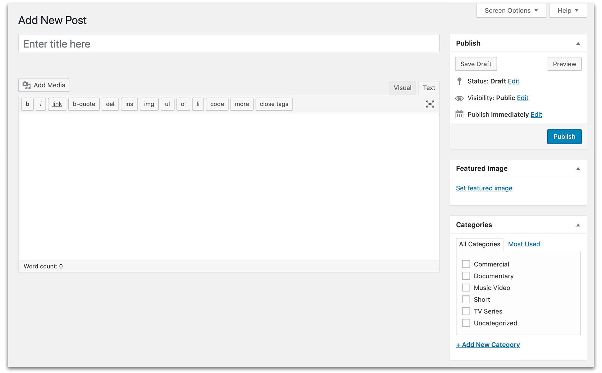
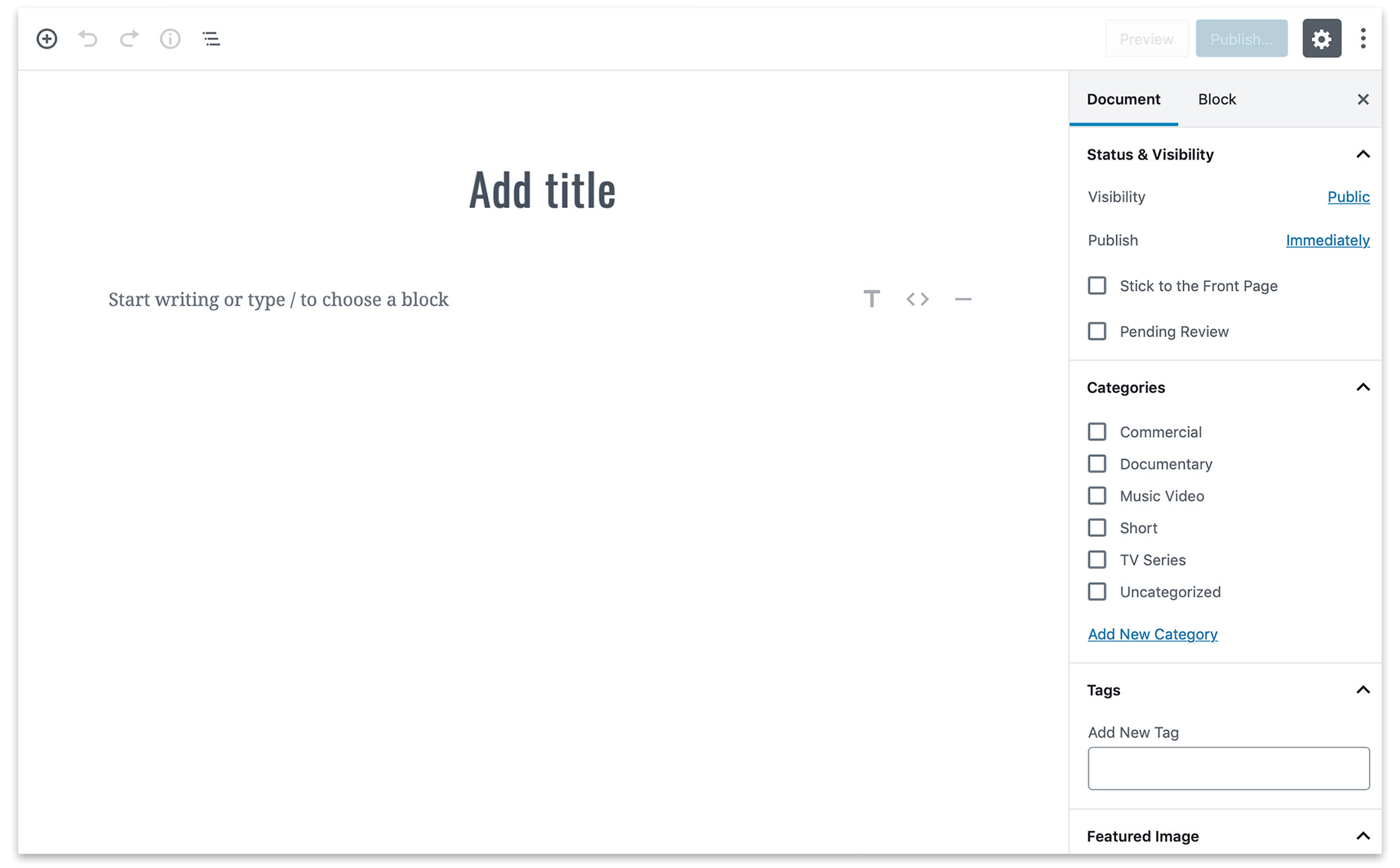
Bellow you can see the difference between the classic TinyMCE editor and the new Gutenberg editor which is much more minimalistic in appearance.
Classic Editor

Gutenberg Editor

This new post editor completely changes the way you create posts in WordPress. Gutenberg is built off the concept of blocks where every item you add is contained with in a block. As you create a post you add blocks for all your different content. Blocks can easily be moved around and offer a lot of options that help you create rich and dynamic posts.
These are some of the many blocks available:
- Headings
- Paragraphs
- Lists
- Quotes
- Verses
- Code & Preformatted Text
- Buttons
- Columns
- Cover Images
- Images
- Image Galleries
- Audio & Video
- Files
- Tables
The Gutenberg editor is also extensible which means people creating WordPress plugins will be able to create plugins that integrate directly into Gutenberg and add new functionality to the post editor. Already they are examples such as the new version of the Jetpack plugin that show the potential of being able to integrate directly into the WordPress editor.
Being intrigued by Gutenberg I decided to try it out and installed it on this website. This post, along with the last 3 or 4 posts were all created with the Gutenberg editor.
Preparing a theme for Gutenberg
The following is some information on how I went about preparing and updating my theme to work with Gutenberg.
With Gutenberg installed the first thing I wanted to do was add support for the new wide and full alignment options that Gutenberg offers. You can so easily by adding the following line to the functions.php file:
// Enable Gutenberg Wide & Full Alignment
add_theme_support( 'align-wide' );
With the wide and full alignment options available I had to make some decisions about how to change site in order to use them. This blog was designed around having max-width of 1040 pixels in one centered column. Some elements, like images, could expand the full 1040 pixels while others like paragraphs were confined to smaller widths, 600 pixels, and centered within the 1040 pixel wrapper column.
For the sake of simplicity I decided to change the max-width of my content to be 100% thus allowing me to use the full alignment option. I don’t see myself using it much on images as it requires really large images, especially on retina screens, but it is really useful for columns and other types of Gutenberg blocks. I then decided to cap the wide alignment at a max-width 1040 pixels so that it matches the size of all the images I have been posting for the last three or four years.
Here in the future I could see myself making it wider in the future but for now I want to skip the headache of adding new image sizes and updating old images.
Aside from adding support for these new alignments there was not too much else that had to be updated for Gutenberg on the front-end of my website. The trickiest bit was dealing with items where Gutenberg offers styling options from within the editor.

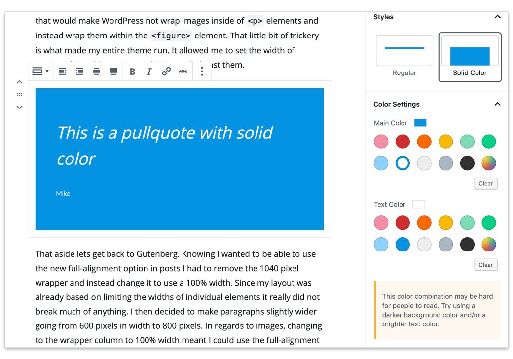
Here is a good example, this is a Pullquote in Gutenberg. The default has borders on the top and bottom but the editor offers options to change the colors of the borders and text. Gutenberg also offers the option to change the background of the Pullquote to a solid color.
It’s nice to have all these options in Gutenberg as it really makes it easy to create dynamic content but it does you need to be careful with your styling. And write CSS that can in certain cases be easily overridden by the styles that Gutenberg adds to posts.
At the moment not all the core Gutenberg blocks offer so many styling options. When you first start playing around in the editor it takes a little time to see what blocks offer styling in the editor and which ones don’t. If I had to make a list of criticism against the editor that would be pretty high on the list. A little more feature parity among the blocks on day one would really go a long way in helping people get used to such a big change in WordPress.
Where things get difficult
Gutenberg also gives you the option to style the actual post editor so that you can make it look more like your front-end. This is a bit more work compared to updating your front-end. In order to style the post-editor you need to enable it in your functions.php file.
//* Loading editor styles for the block editor (Gutenberg)
function site_block_editor_styles() {
    wp_enqueue_style( 'site-block-editor-styles', get_theme_file_uri( 'editor-style.css' ), false, '1.0', 'all' );
}
add_action( 'enqueue_block_editor_assets', 'site_block_editor_styles' );
So that function sets your theme up so that the Gutenberg editor looks for a file called editor-style.css in your theme’s main directory. But like I already said styling the editor on the back-end is a lot of work. In difference to the front-end Gutenberg is styling all the items on the backend so you are overriding a ton of CSS. You also need to be careful not to write CSS that is too general otherwise you might find yourself messing up the styling of other elements on the back-end that are not actually a part of the Gutenberg editor.
You want to style post editor in Gutenberg then this link might help get you going also Smashing Magazine has a deep dive into Gutenberg that is worth checking out.
That’s it for now. Really looking forward to Gutenberg being released.