I originally discovered Strobox about a year ago. At the time it was a stand alone iPhone app that allowed you to create lighting diagrams on your iPhone and then save them. I thought it was a great idea and I’ve had the app on my iPhone since. However recently I’ve discovered that the people behind the application have been building a community on their website where people share images and the lighting plans behind them and this has really re-sparked my interest in both the iPhone app and in their website.
The iPhone app
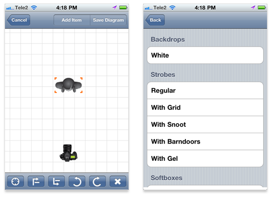
Strobox is available as a free download in the app store, and it’s really straight forward to use. On the main

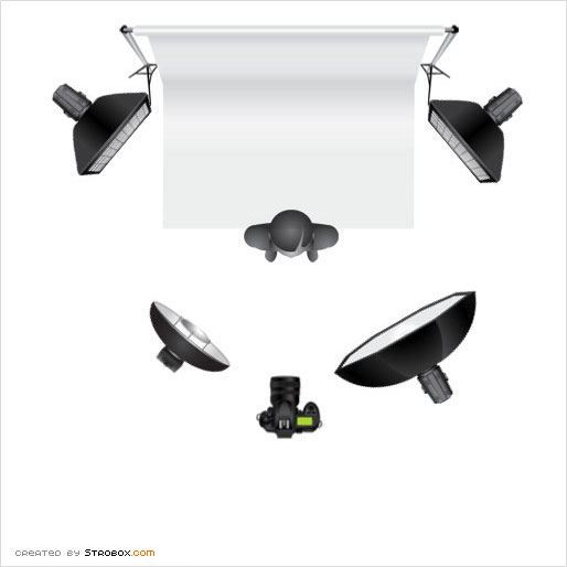
As you can see from the diagrams, it really is straight forward and only takes a minute or two to figure out how everything works. You can then quickly make and save lighting diagrams like the one shown bellow. All the diagrams are saved inside the app and you can e-mail them to yourself or an assistant.

What’s the app missing?
The app is really great, especially for a free download. However it is missing some features that could help it become more complete and useful.
– Labels & notes
It would be extremely useful to be able to add labels and information to the lights and items you place on the grid. This information should be able to be toggled visible and invisible and should be exported on the side of your lighting diagram. This would allow you add information about filters, f-stop levels, and height placement of lamps. It would also make up for some of the short comings in the list of selectable items. For example, at the moment the only backdrop selectable is a white one. With notes you can quickly specify that the backdrop will be red, yellow, or a certain wall.
– Have images stores themselves in the iPhones picture library
Currently all diagrams you make are saved inside of the app, and you need to email them to yourself to get them off of the phone. If they were stored in the phone’s photo library you could quickly sync a bunch of diagrams over to your desktop or laptop.
** Correction **
This actually is already an option, which I foolishly missed.
– An iPad version
I currently don’t own an iPad, although I do lust after one. Looking on my iTunes apps I see that Strobox is listed as iPhone and iPod Touch only and I wonder “Where the heck is the iPad version?” Using Strobox on the iPhone and you can find that the screen get’s filled up pretty quickly. On the iPad you could fit the entire grid on the screen along with the list of selectable items. It could quickly be made much more functional and powerful.
The website
As I mentioned at the start of the post, I only recently discovered the website for Strobox and the community they are building on it. On the Strobox

It’s a pretty simple concept “create, share, & learn” and it works really well. People are adding images on a regular basis and a lot of them are extremely interesting. The added lighting diagrams give you a lot of insight into how certain effects were accomplished. You can find both inspiration and pick up a little knowledge, you really couldn’t ask for more. So that’s Strobox, I definitely recommend you visit their website and download the iPhone app.