WordPress 5.0 is out and since I was already using the Gutenberg editor as a plugin I went ahead and upgraded. Overall, like I wrote in my previous Gutenberg post, I remain positive on the new editor. I think if WordPress is going to last another 15 years it has to modernize a lot of its components and the post creation process was ripe for a makeover.
Having said that … man does Gutenberg have some rough edges. I really hope that once the holidays are over updates start coming in regularly because there are a lot of bugs in this new post editor.
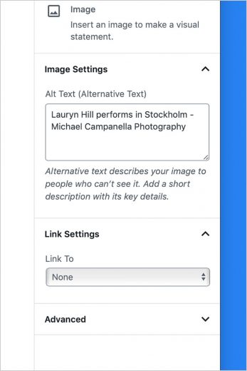
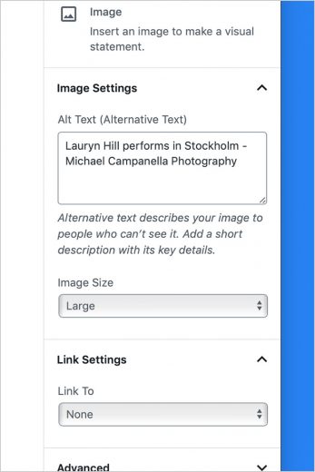
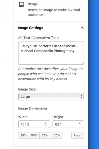
Here is one that has been annoying me to no end. Click on an image block will bring up the image settings panel in the right-hand sidebar.
The Alt Text is the only thing that seems persistent. But the image size option, the image dimension options I never know when they will turn up. It’s incredibly frustrating.
To make it even more annoying I cloned my entire website and set it up to run locally on my Mac. I can open the same post on the website on my Mac and on the web, click on the same image, and get two different versions of the image settings panel. Go figure.
That’s one example which is especially annoying when dealing with a website that is mostly about photography. However, there are a lot more bugs that often creep up. As I said before I hope that Automattic and the WordPress team plan on pushing through aggressive bug fixes once the holidays are over. I can agree with the idea that pushing Gutenberg out as the default was important and needed to happen but you do not want people turning to the Classic Editor plugin to become the norm. For it to become established to the point web hosts include the plugin on new installs.


